Week 5-7: Making The Network Visualization
The first problem I came across after deciding to do this project was deciding its scope. At first I imagined a vast network visualization connecting all clubs, societies and student organizations through their co-sponsored events. After realizing that the Clubs and Societies Collection was comprised of 22.5 Linear feet of 12 records storage boxes, 18 archives boxes, 7 half archives boxes and 2 flat boxes and this did not include the individual collections some student organizations also collect, I quickly reconsidered. I then had to create an evolving flexible criteria for what student groups and events I would be included as part of the final project.

I first decided to limit what groups would be included in the final visualization by only focusing on affinity groups. I defined affinity groups as a group formed around a shared interest or common goal and exists to support a specific identity. These identities ranged from, racial, national and sexual, to gender and political. To attain a preliminary list of these organization I looked through the Amherst Student Groups and Publications page and wrote down each organization that I felt fit the definition of an Affinity Group. I also initially listed the resources centers found on this page, but eventually chose to remove them from the list.
Although they do serve the same essential function of allowing students whose identities are often overlooked in larger society to express an aspect of themselves in an environment that is designed to support them, they aren’t student run organizations and including them doesn’t help highlight student contributions to Amherst College. Any other affinity groups that is not listed on the Amherst Student Groups and Publications page and can be found in the final network visualization was added after being cited on events found while exploring the Archives and Special Collections.
The Second Problem I came across was how I would organize my information without having already chosen a network visualization tool. I needed to make sure I recorded the most essential information for all the events I recorded, while making sure that they were recorded in an efficiently organized and understandable way. In my first spreadsheet I chose to organize all the event information I was collecting based on affinity group’s archives they were found in. I numbered each event, recorded their descriptions, dates, all groups involved (regardless of if they are Affinity Groups or not), whether they had posters, and sources in the Archives and Special Collections.


After spending about a week and a half going through many different collections, I finally felt that I’d reached a critical mass of materials and should continue my search for network visualization tools that would present the information I’d collected in the most visually captivating and intuitively understandable way. The most commonly used network visualization tool for digital humanities projects is Gephi. I had never used Gephi before and was told that it was generally difficult to for beginners to learn. Having less 3 full weeks left, I wasn’t eager to spend a large portion of that time learning to use a complicated tool. Additionally, I felt that Gephi simply looked visually unappealing and outdated, and I didn’t want the centerpiece of what I’d imagined to be a very visual project to be one of the least captivating parts of the website.


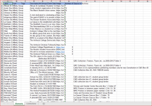
I then browsed google and came a across http://dataviz.tools/ which introduced me to the network visualization tool that I chose for this project; https://kumu.io/ . I chose Kumu because although it’s very customization and flexible like Gephi, its layers of difficulty make it easier to learn, it looks vastly superior and its user interface was more captivating and interactive. Having chosen Kumu, I now had to reformat my data in a way that Kumu could read it. For this, I transferred my google spreadsheet into an excel spreadsheet and created a row for each event and affinity group that would correspond to each element in the visualization. An element is the term used for a node in Kumu. (node: a point at which lines or pathways intersect or branch; a central or connecting point). This format allowed me to input a larger range of information about all organizations and events, and within their own section. A second page of this document is used to draw and describe connections between nodes. I used this page to connect affinity groups to events.

Since I was pretty much done inputting the network visualization information and connections, I then focused on making it more visually appealing by adding pictures that corresponded to each element. To find pictures for event elements, I went back into the archives one last time, collected all the posters I’d drawn event information from and had them imaged by the Digital Programs Photography Intern. I found pictures for affinity groups through their Facebook pages or on https://thehub.amherst.edu/. After formatting, and uploading the pictures, I was finally done.
To make the timeline component, all I had to do was reformat the data and only include event information.

Continue to Unfinished Business: More for the Visualization, and Black Men and Black Women of Amherst
Back to The Process Part 1: Exploration