What information is featured in this visualization?:
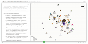
This is a network visualization of co-sponsored events or endeavors by Amherst College Affinity Groups. All events or endeavors featured in this visualization were found within the Amherst College Archives and Special Collections. No online searches or any other methods were used to obtain event information. The scope of this project was limited to the materials within the archives. Their were also many events found that were sponsored by one Affinity Group or co-sponsored by an Affinity Group without the involvement of any other Affinity Group. These events were not added to this list. You can download the data behind the visualization from Google Drive.
Why does it look like this?:
An element is the term used for a node in Kumu. (node: a point at which lines or pathways intersect or branch; a central or connecting point).
Although the position and size of each element is randomly generated every time the page is refreshed, these aspects of the network visualization are controlled by several parameters put into the code. The size of each element(events and affinity groups) is dictated by the number of connections they have. An organization that co-sponsored more events or an event that has more co-sponsors will have a larger element. The proximity of Affinity Group and Event elements to each other depends respectively on the frequency of events they co-sponsor together or co-sponsors for that particular event. Since B.S.U and La Causa have co-sponsored the many events, they almost always appear overlapped with one another. The distance of an element to the middle of the visualization is also dependent on the number of connections it has. That’s why Affinity Group elements with no found connections generally float around the perimeter of the visualization.
How to interact with the visualization:
- Clicking on an element reveals information about it.
- Clicking on a connection gives information about the Affinity Group and Event that is connects.
- If the sidebar to the left is not opened, you will not be able to view this information after you click on the element. This can be fixed by clicking the three opaque vertical dots at the center leftmost point of the visualization. Clicking this toggles descriptions in and out.
- Hovering your cursor over an element will cause all other elements and connections that are not connected to the element you are hovering over to fade into the background. This allows you focus on all Events or Co-sponsor affiliated with an element.
- You can zoom in and out of the visualization by using the (+) and (-) buttons at the top right of the visualization. You can also use the “zoom fit” button below both of those to focus on the entire visualization.
The Timeline
You can also explore the data from the network visualization in an interactive timeline, below or in TimeMapper. The data behind the timeline is available for download from Google Drive.
Continue to The Process Part 1: Exploration